Il Nido - How to create a cohesive Instagram feed
- Jan 27, 2020
- 2 min read
Il Nido is an independent boutique in Hungary, sourcing and selling beautiful women wear from Italy. Judit, the founder of this little hidden treasure is ready to step up her game and use her shop as a base of a community where she empowers women through fashion and styling.
After this little intro let me show you one of the little things we've done for Il Nido.
After her recent rebrand, Judit didn't know how to start implementing the delicacy of the new style. Firstly we had to nail down her visual strategy and create a concept that she can follow. It has to be clear and actionable and most of all easily digestible to her audience. Once we have worked out the system we turned our focus to the visual part of the visual strategy and the results speak for themselves.


When we have a relevant, up to date logo, my work is always so much easier.
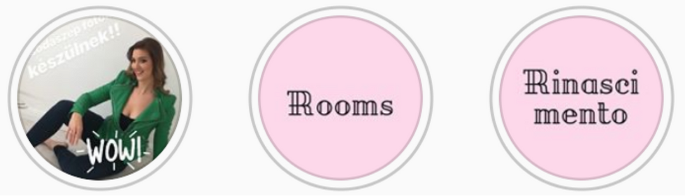
The first thing was to break down Il Nido's logo into elements and built the whole online presence around it, starting with the highlight icons.
It is such a simple little step yet makes such a great difference for your audience. This is the first impression they get when they visit your Instagram feed.
Let's see the old icons...

Judit would like to bring some pink to the branding - and we will do that later on, but this is just not doing anything for the logo. It's overpowering and completely off-brand now. So how you can support your logo? Using elements and/or colours from your branding kit will enhance your brand's presence.
So based on the all above, here are the new highlights. They're just too pretty, aren't they?


Now once our header part is united, the next step is to look further down on your feed. There a trillion ways you can build a pattern and enhance your branding on your feed and after some chatting on what's doable and what is Il Nido style, we've decided on only portrait, white border theme where the colours of the clothes will merge into each other. Now how do we bring the branding in here?
Templates, fonts and colours.


Make sure you don't overuse it because that can come out a bit too cheap or sickly, but a little hint of your brand here and there is always a good idea.
Look at the before / after snapshots! I loooove showing off with my clients' fee, just like a proud mummy.


And last but not least Instagram stories... Not taking away the spontaneity of the feature it is important to post branded content there from time to time. Just make sure that alongside your ad-hoc stories to show up with content that incorporates your elements.


What do you think? I'm so happy with the progress we've done in only a month time and as Judit is in my mentorship program I can only imagine the transformation her brand will go through in the future?
If you fancy looking into what we could do for your business then have a look at my Visual Strategy Bundle or Mentorship. It isn't about to make it pretty. It is about making it clear and represent the strong foundation of your message and brand.


Comments